Kairos Power

Role and Scope

When the product is credibility, the design has to prove it.

I was the sole designer on a year-long website redesign for Kairos Power, a company developing advanced nuclear reactor technology. While the subject matter was highly technical, the core challenge wasn’t visual. It was helping a precise, engineering-driven organization communicate a complex story to a diverse audience that included investors, recruits, regulators, policymakers, and a public still learning how to think about next-generation nuclear energy.


As the project evolved, it became clear that the challenge extended beyond designing a few pages. Working alongside strategists, content leads, developers, and client stakeholders, I helped translate a constantly evolving narrative into a scalable digital system. I developed a modular framework capable of supporting new content, simplifying complex concepts, and reinforcing credibility through structure, clarity, and consistency. I also directed the site’s interactive and motion design, using AI-assisted workflows to accelerate production and focus more of my time on strategy, systems, and experience design.

My Contributions

Interaction Design

Interaction Design

Digital Experience Design

Digital Experience Design

Cross-Party Motion Production

Cross-Party Motion Production

Year

/

2026

Client

/

Kairos Power

The problem behind the problem


The brief looked like "design a website." The real problem was organizational and communicative.

Kairos's whole strategy is learning by building, proving a hard technology through real, successive demonstrations rather than asserting it. That makes credibility the product, and credibility is hard to manufacture when the people who hold the knowledge are engineers, the technology is difficult, and the audience ranges from regulators who need rigor to newcomers who need a way in. This was a full rebrand and redesign, and the client was learning about itself as we went, so requirements kept shifting through the build. The work was as much managing evolving scope as creating screens, the design had to support coherence through ongoing change, not just hold together at launch.

So the problem in front of me was, how do you make a moving target of complex, high-stakes content legible and trustworthy, repeatably?

Thinking in systems, not pages

This was more than a template library. Each component was designed as a flexible system with rules for how content could change. Tabs could support a single item or expand as needed. Partnership content could appear within an existing page structure instead of requiring a new template. Media regions were defined by purpose, allowing the format to change without affecting the layout around it.

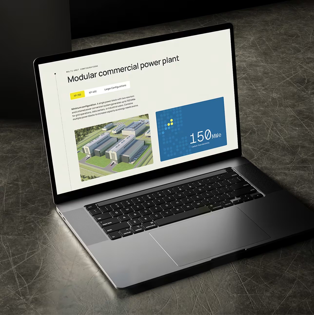
The system also reflects how Kairos develops its technology, through repeatable modules that evolve over time. That shared logic made the site easier to extend while giving the interface a structure the organization already understood. The design became evidence of how Kairos thinks, rather than a layer placed over the story.

The deeper move was aligning the design system with the company’s own operating logic. Kairos develops its technology through iterative, modular stages, and the system follows the same principle: repeatable units capable of scaling, adapting, and evolving over time. For an engineering-driven organization, the design itself became part of the argument for credibility as well as a vehicle for communicating it.

03 Key Decision
What proof to surface, and when

For a company whose value depends on credibility, the challenge wasn’t whether to show proof, it was deciding which proof mattered most and when to introduce it. Working alongside content strategists and the client, we agreed to approach the pages as a sequenced reveal, surfacing evidence such as their detailed reactor renderings, NRC permits, national lab partnerships, the Google and TVA agreements, and key operating metrics at moments where readers had enough context to understand why they mattered.


The modular system made that evidence easy to scale and repeat across facilities, but deciding what actually constituted proof remained a human judgment. Restraint was key. Showing everything at once risks overwhelming a skeptical audience, while revealing evidence progressively helps build understanding and trust.

03 Key Decision

What proof to surface, and when

For a company whose value depends on credibility, the challenge wasn’t whether to show proof, it was deciding which proof mattered most and when to introduce it. Working alongside content strategists and the client, we agreed to approach the pages as a sequenced reveal, surfacing evidence such as their detailed reactor renderings, NRC permits, national lab partnerships, the Google and TVA agreements, and key operating metrics at moments where readers had enough context to understand why they mattered.


The modular system made that evidence easy to scale and repeat across facilities, but deciding what actually constituted proof remained a human judgment. The discipline was restraint. Showing everything at once risks overwhelming a skeptical audience, while revealing evidence progressively helps build understanding and trust.

Outcome + public stakes

The site launched in January 2026, but launch was not the real measure of success. The design had to hold its shape while Kairos continued to define its story. I built the system to flex, allowing new content and facilities to enter the existing structure without forcing a redesign. That framework kept the project moving without losing its logic.

Technical accuracy was non-negotiable. Kairos engineers approved the final work, confirming that the site made the reactor understandable without distorting how it works. That clarity mattered during a period when the company secured the first NRC construction permit for a Generation IV reactor and entered major agreements with Google and TVA. This was a trust-building project, designed to withstand scrutiny.

01 Key Decision
Translating complexity

The reactor was the most important part of the experience and the hardest to make legible. Instead of compressing the system into a technical diagram, I developed a spatial narrative that moves from the reactor vessel to a single fuel particle. Each interaction reveals another layer, giving people time to understand the technology at the right scale.

I built the visual approach and storyboards, then directed the interaction and motion design with our motion partner. The aim was to clarify the system without flattening its complexity.

Because the technology was still evolving, alignment across teams required constant attention. I used AI-assisted workflows to map feedback against each version and identify where assumptions had split. This made it easier to protect the narrative while working within performance constraints, resulting in an experience that remained clear and responsive.

01 Key Decision
Translating complexity

The reactor was the most important part of the experience and the hardest to make legible. Instead of compressing the system into a technical diagram, I developed a spatial narrative that moves from the reactor vessel to a single fuel particle. Each interaction reveals another layer, giving people time to understand the technology at the right scale.

I built the visual approach and storyboards, then directed the interaction and motion design with our motion partner. The aim was to clarify the system without flattening its complexity.

Because the technology was still evolving, alignment across teams required constant attention. I used AI-assisted workflows to map feedback against each version and identify where assumptions had split. This made it easier to protect the narrative while working within performance constraints, resulting in an experience that remained clear and responsive.

01 Key Decision
Translating complexity

The reactor was the hardest thing to explain and the most important thing to get right. Rather than relying on a dense technical diagram, I developed the visual approach and storyboards for an interactive experience that moves from the reactor vessel down to a single fuel particle, revealing one layer at a time. Working closely with a motion partner, I directed both the interaction and motion design to make a highly technical system easier to understand without oversimplifying it.


Because the technology was still evolving, the work required close coordination between the client, motion studio, and internal team. I used AI-assisted workflows to track feedback, compare versions, and surface areas where assumptions had started to diverge. Throughout the process, I balanced storytelling with performance, ensuring the experience remained smooth, clear, and engaging.

02 Key Decision
Showing a cycle on one clear path

The roadmap arrived as a styling update request and was really an information-architecture problem: how do you show a cyclical plan-design-build-test process inside a linear, left-to-right timeline that still holds up on a phone? I used Claude Code to compress the exploration, turning the client's scattered prior versions, kickoff notes, and sketches into navigable, responsive-aware directions in a fraction of the time, which freed me to spend the hours on the real problem. The resolution: a linear progression of reactors with the cycle rendered as a literal loop between each stage, the legend folded into mobile tooltips, and the commercial fleet made the visual endpoint. The tool compressed the production; the linear-versus-cyclical call was the judgment.


02 Key Decision

Showing a cycle on on clear path

The roadmap arrived as a styling update request and was really an information-architecture problem: how do you show a cyclical plan-design-build-test process inside a linear, left-to-right timeline that still holds up on a phone? I used Claude Code to compress the exploration, turning the client's scattered prior versions, kickoff notes, and sketches into navigable, responsive-aware directions in a fraction of the time, which freed me to spend the hours on the real problem. The resolution: a linear progression of reactors with the cycle rendered as a literal loop between each stage, the legend folded into mobile tooltips, and the commercial fleet made the visual endpoint. The tool compressed the production; the linear-versus-cyclical call was the judgment.

Reflection


The hardest parts of this project were not visual design problems. They surfaced between teams, when shared language began to carry different meanings.

My role expanded beyond designing screens. I created a working structure that kept the creative intent aligned with the technical reality as both evolved.

I once saw translation as a byproduct of design. Here, it became the design work. I am proudest of the judgment it took to make complexity legible and keep the project moving in one direction.

Next work